Timeline:
4 weeks
Client:
Tropina
Role:
Brand Identity, Packaging & Art Direction
Year:
© 2026

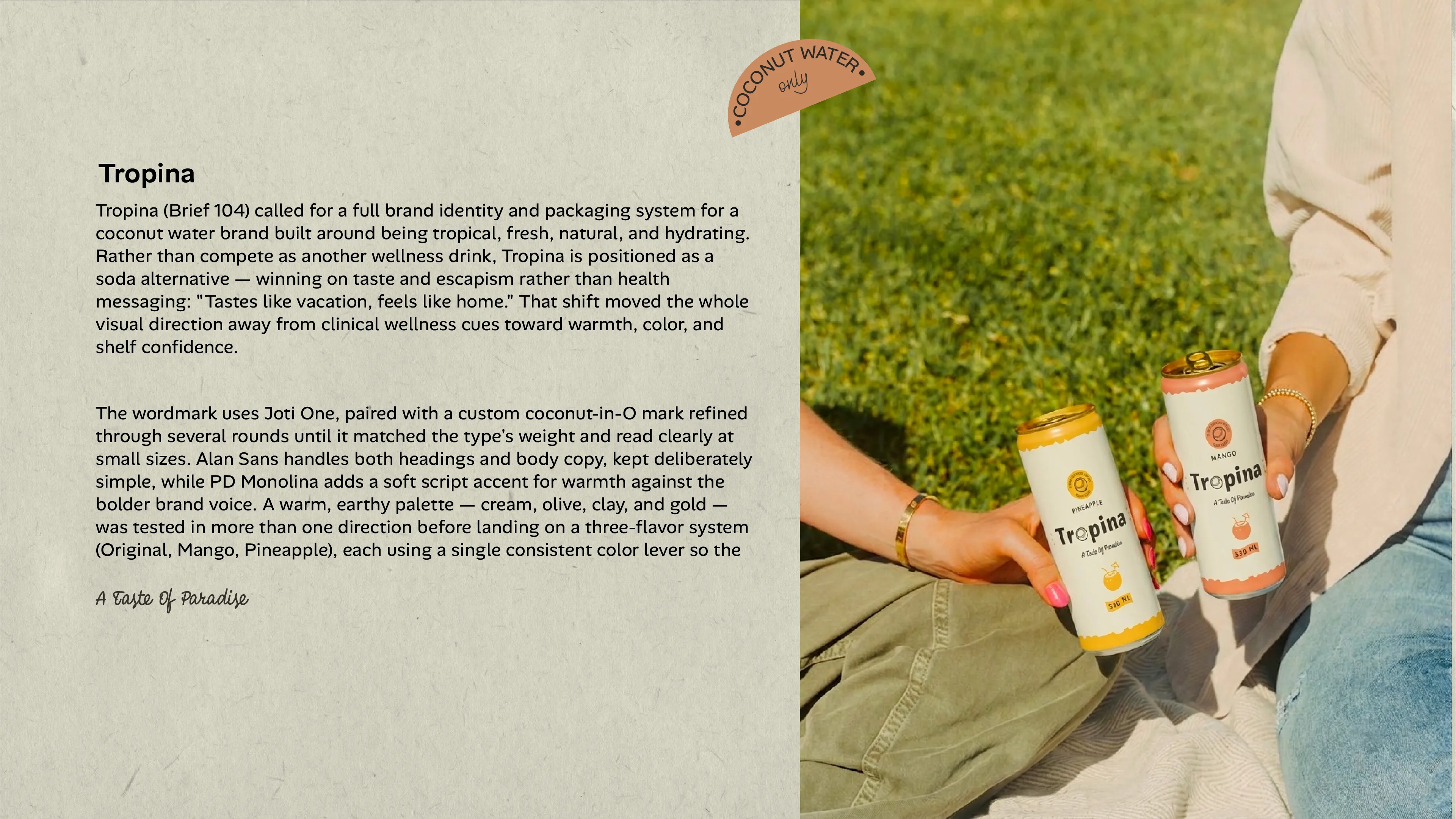
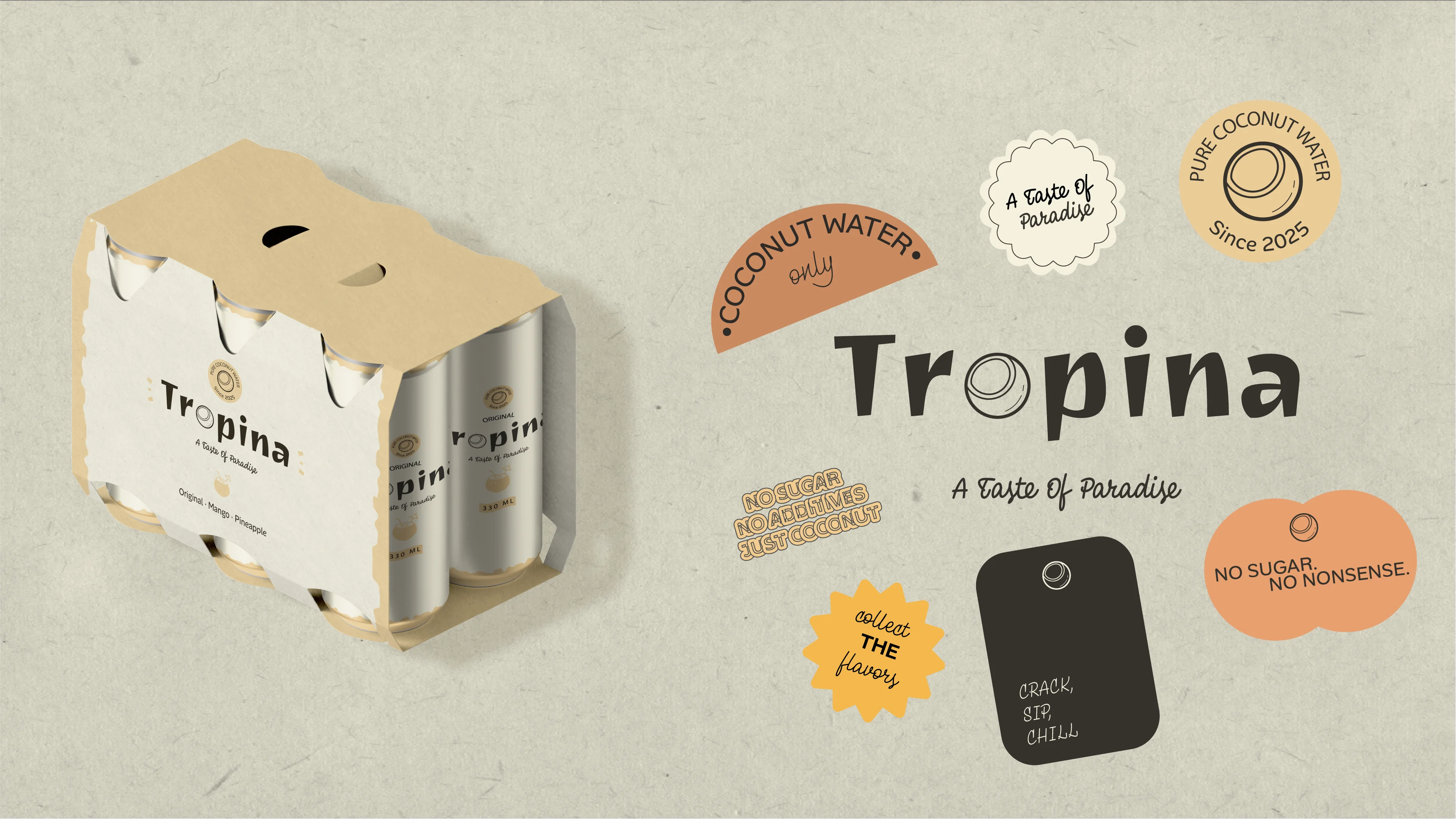
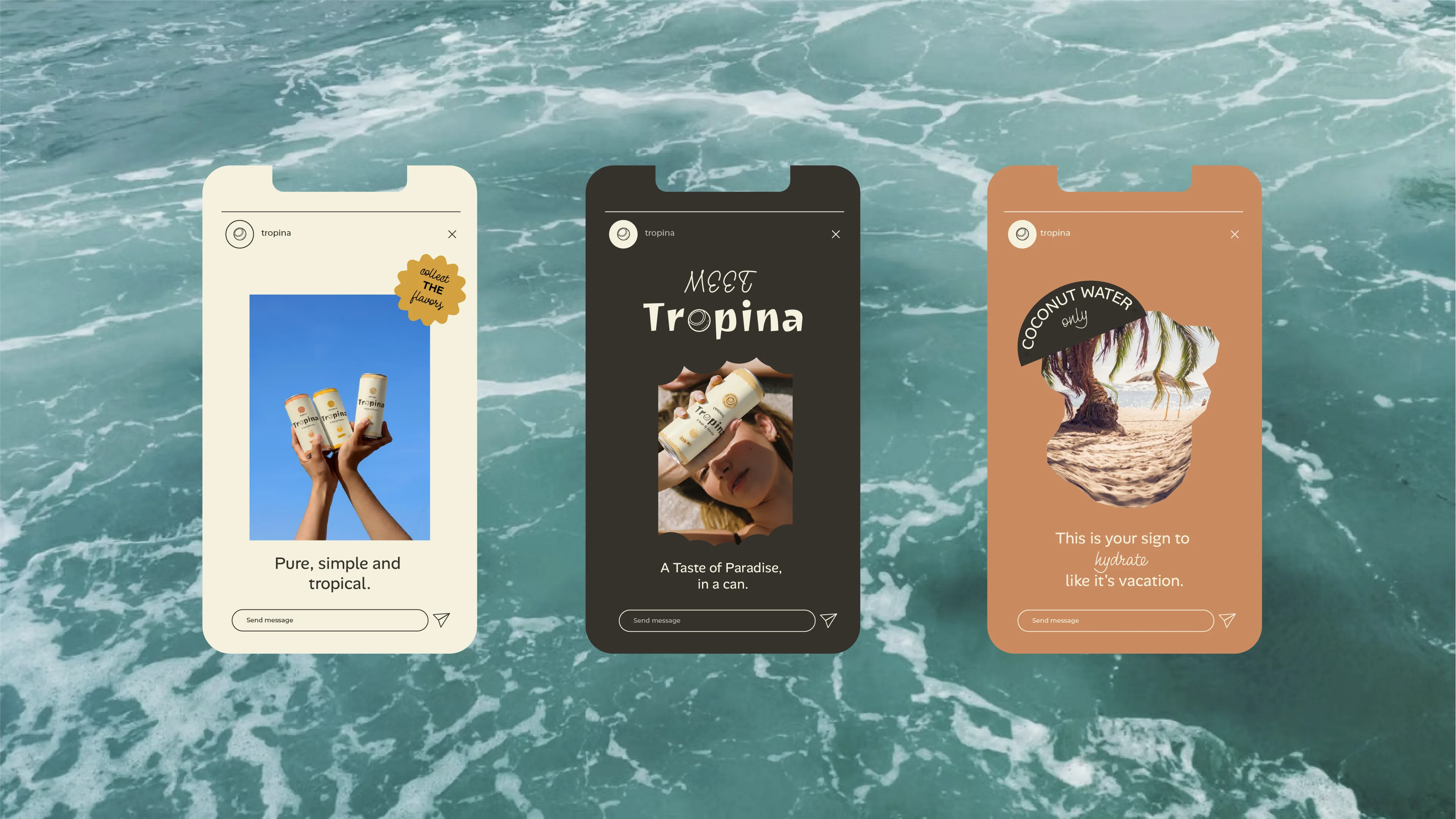
Tropina (Brief 104) called for a full brand identity and packaging system for a coconut water brand built around being tropical, fresh, natural, and hydrating. Rather than compete as another wellness drink, Tropina is positioned as a soda alternative — winning on taste and escapism rather than health messaging: "Tastes like vacation, feels like home." That shift moved the whole visual direction away from clinical wellness cues toward warmth, color, and shelf confidence.
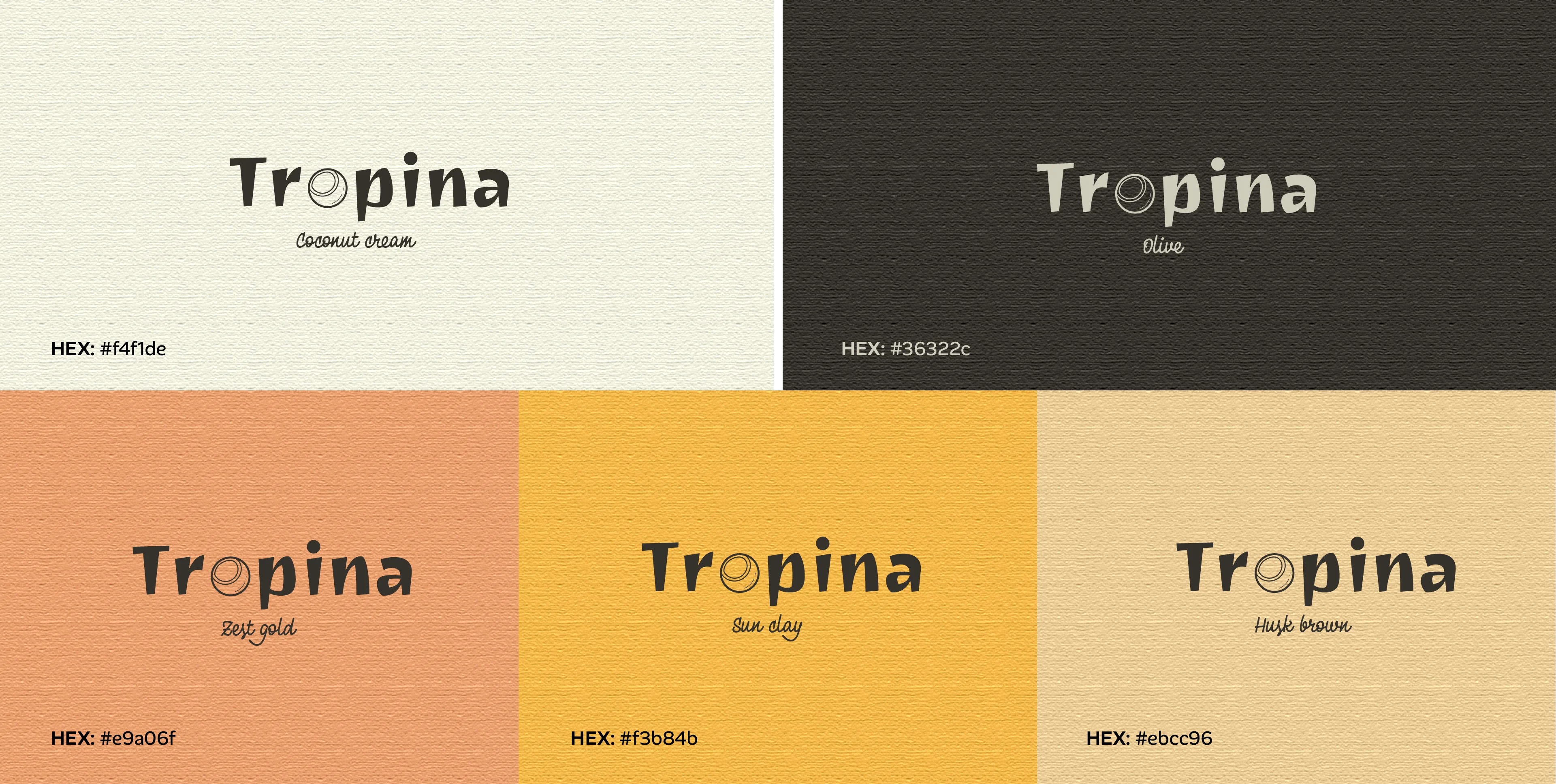
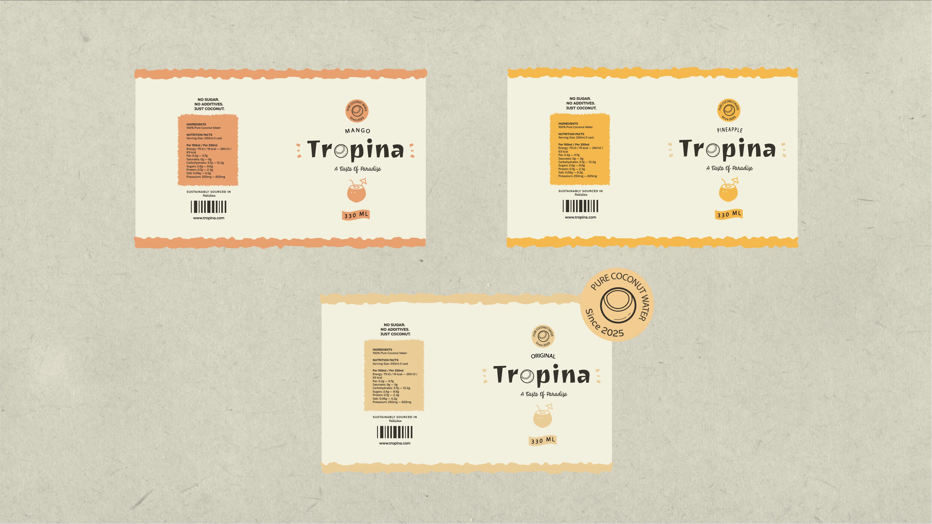
The wordmark uses Joti One, paired with a custom coconut-in-O mark refined through several rounds until it matched the type's weight and read clearly at small sizes. Alan Sans handles both headings and body copy, kept deliberately simple, while PD Monolina adds a soft script accent for warmth against the bolder brand voice. A warm, earthy palette — cream, olive, clay, and gold — was tested in more than one direction before landing on a three-flavor system (Original, Mango, Pineapple), each using a single consistent color lever so the family reads as one brand at a glance. A recurring torn-edge texture ties the badge, packaging, and applications into one cohesive system.